Table of Contents
机器学习05-分类模型评估方法#
数据prepare#
数据集包含 10 列特征,以及一列类别标签。其中:
第 1 ~ 6 列为客户近期历史账单信息。(特征)
第 7 列为该客户年龄。(特征)
第 8 列为该客户性别。(特征)
第 9 列为该客户教育程度。(特征)
第 10 列为该客户婚姻状况。(特征)
第 11 列为客户持卡风险状况。(分类标签:LOW, HIGH)
import pandas as pd

df = pd.read_csv("../data/credit_risk_train.csv")  # 读取数据文件
df.head()
| BILL_1 | BILL_2 | BILL_3 | BILL_4 | BILL_5 | BILL_6 | AGE | SEX | EDUCATION | MARRIAGE | RISK | |
|---|---|---|---|---|---|---|---|---|---|---|---|
| 0 | 0 | 0 | 0 | 0 | 0 | 0 | 37 | Female | Graduate School | Married | LOW |
| 1 | 8525 | 5141 | 5239 | 7911 | 17890 | 10000 | 25 | Male | High School | Single | HIGH |
| 2 | 628 | 662 | 596 | 630 | 664 | 598 | 39 | Male | Graduate School | Married | HIGH |
| 3 | 4649 | 3964 | 3281 | 934 | 467 | 12871 | 41 | Female | Graduate School | Single | HIGH |
| 4 | 46300 | 10849 | 8857 | 9658 | 9359 | 9554 | 55 | Female | High School | Married | HIGH |
df["RISK"].unique()
array(['LOW', 'HIGH'], dtype=object)
from sklearn.model_selection import train_test_split
from sklearn.preprocessing import scale

# 将分类标签替换为数值,方便后面计算
df.RISK = df.RISK.replace({"LOW": 0, "HIGH": 1})

# 获取特征数据列
train_data = df.iloc[:, :-1]

# 字符串类型的特征 => 独热编码
train_data = pd.get_dummies(train_data)

# 规范化处理
train_data = scale(train_data)

# label
train_target = df['RISK']

# 划分数据集,训练集占 70%,测试集占 30%
X_train, X_test, y_train, y_test = train_test_split(
    train_data, train_target, test_size=0.3, random_state=0)

X_train.shape, X_test.shape, y_train.shape, y_test.shape
((14000, 16), (6000, 16), (14000,), (6000,))
逻辑回归算法实现#
from sklearn.linear_model import LogisticRegression

# 定义逻辑回归模型
model = LogisticRegression(solver='lbfgs')

# 使用训练数据完成模型训练
model.fit(X_train, y_train)
LogisticRegression()In a Jupyter environment, please rerun this cell to show the HTML representation or trust the notebook.
On GitHub, the HTML representation is unable to render, please try loading this page with nbviewer.org.
LogisticRegression()
y_pred = model.predict(X_test)  # 输入测试集特征数据得到预测结果
y_pred
array([1, 1, 1, ..., 1, 1, 1])
混淆矩阵#
定义正类和负类,例如这里我们定 HIGH 为 正类,LOW 为负类,可以得到以下混淆矩阵:
信用风险 |
HIGH |
LOW |
|---|---|---|
HIGH |
True Positive (TP) |
False Negative (FN) |
LOW |
False Positive (FP) |
True Negative (TN) |
上表含义:
TP:将正类预测为正类数 → 预测正确
TN:将负类预测为负类数 → 预测正确
FP:将负类预测为正类数 → 预测错误
FN:将正类预测为负类数 → 预测错误
准确率(Accuracy)#
import numpy as np

def get_accuracy(test_labels, pred_lables):
    # 准确率计算公式,根据公式 2 实现
    correct = np.sum(test_labels == pred_lables)  # 计算预测正确的数据个数
    n = len(test_labels)  # 总测试集数据个数
    acc = correct / n
    return acc

get_accuracy(y_test, y_pred)
0.7678333333333334
from sklearn.metrics import accuracy_score

accuracy_score(y_test, y_pred)  # 传入真实类别和预测类别
0.7678333333333334
model.score(X_test, y_test)
0.7678333333333334
精确率(Precison)#
正确分类的正例个数占预估为正例的总数的比例。
from sklearn.metrics import precision_score

precision_score(y_test, y_pred)
0.7678333333333334
召回率(Recall)#
正确分类的正例个数占实际正例总数的比例。 $\( Recall = \frac{TP}{TP+FN} \)$
from sklearn.metrics import recall_score

recall_score(y_test, y_pred)
1.0
F1值#
F1值是召回率和准确率的加权平均数。 $\( F1 = \frac{2 \cdot Precison \cdot Rrecall} {Precison + Recall} \)$
from sklearn.metrics import f1_score

f1_score(y_test, y_pred)
0.8686716319411709
ROC曲线#
分类模型中,通常会设定一个阈值,并规定大于该阈值为正类,小于则为负类。所以,当我们减小阀值时,将会有更多的样本被划分到正类。这样会提高正类的识别率,但同时也会使得更多的负类被错误识别为正类。ROC 曲线的目的在用形象化该变化过程,从而评价一个分类器好坏。
横轴: $\( FPR = \frac{FP}{FP+TN} \)$
纵轴: $\( TPR = \frac{TP}{TP+FN} \)$
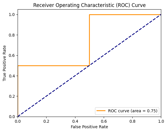
代码示例:
import numpy as np
from sklearn.metrics import roc_curve, auc
import matplotlib.pyplot as plt
%matplotlib inline


# 生成一些示例数据
y_true = np.array([0, 0, 1, 1])
y_scores = np.array([0.1, 0.4, 0.35, 0.8])

# 计算ROC曲线的参数
fpr, tpr, thresholds = roc_curve(y_true, y_scores)
roc_auc = auc(fpr, tpr)

# 绘制ROC曲线
plt.figure()
plt.plot(fpr, tpr, color='darkorange', lw=2, label='ROC curve (area = %0.2f)' % roc_auc)
plt.plot([0, 1], [0, 1], color='navy', lw=2, linestyle='--')
plt.xlim([0.0, 1.0])
plt.ylim([0.0, 1.05])
plt.xlabel('False Positive Rate')
plt.ylabel('True Positive Rate')
plt.title('Receiver Operating Characteristic (ROC) Curve')
plt.legend(loc="lower right")
plt.show()
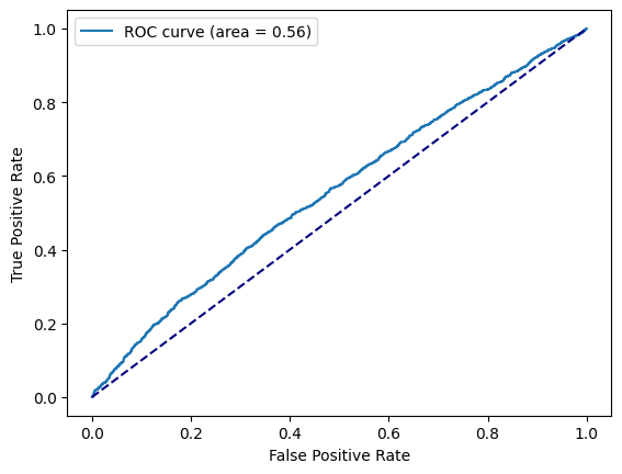
from sklearn.metrics import roc_curve, auc
from matplotlib import pyplot as plt
%matplotlib inline


# 计算样本打分
y_score = model.decision_function(X_test)

fpr, tpr, _ = roc_curve(y_test, y_score)
roc_auc = auc(fpr, tpr)

plt.plot(fpr, tpr, label='ROC curve (area = %0.2f)' % roc_auc)
plt.plot([0, 1], [0, 1], color='navy', linestyle='--')
plt.xlabel('False Positive Rate')
plt.ylabel('True Positive Rate')
plt.legend()
<matplotlib.legend.Legend at 0x13c89e580>
AUC计算#
工业界数据量通常都比较大,常用的计算AUC的方式如下(阈值为0.5):
def auc(data):
    """计算auc"""
    data_sort = sorted(data.items(), key=lambda x: x[0], reverse=True)
    ack = [x[1][0] for x in data_sort]
    clk = [x[1][1] for x in data_sort]
    sample_num = sum(ack)
    pos = sum(clk)
    neg = sample_num - pos
    if pos < 1 or neg < 1:
        return 0
    roc_arr = []
    tp = fp = 0
    for i, j in zip(ack, clk):
        tp += j
        fp += (i - j)
        roc_arr.append((float(fp) / neg, float(tp) / pos))
    auc = 0
    prev_x = 0
    for x, y in roc_arr:
        auc += (x - prev_x) * y
        prev_x = x
    return round(auc, 5)

# 打分分桶: [到达量, 点击量]
data = {
    "0.1000": [1, 0],
    "0.4000": [1, 0],
    "0.3500": [1, 1],
    "0.8000": [1, 1]
}

auc(data)
0.75